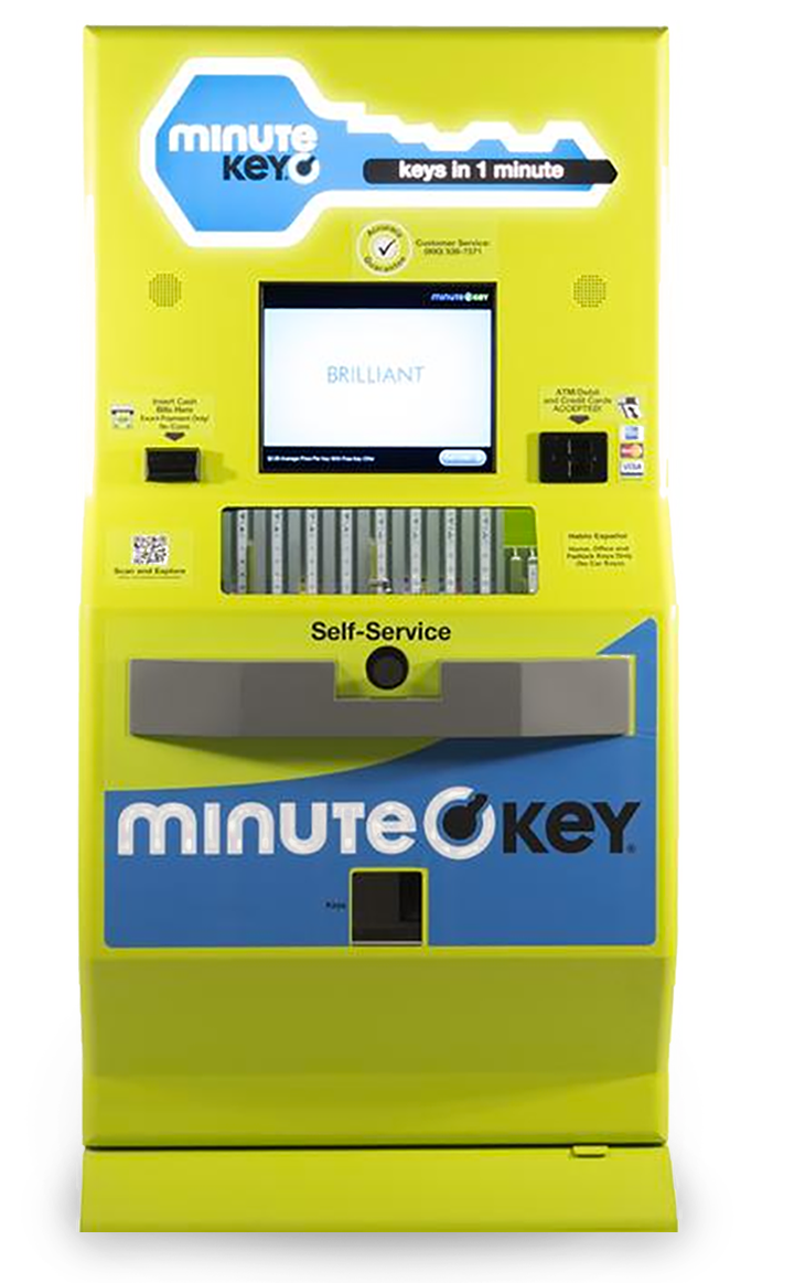
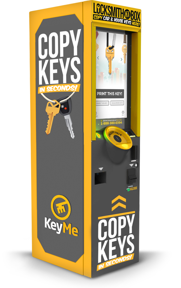
What's already out there?
What do users say?
SECURITY CONCERNS
“I'm afraid they'll have my key information and make many more."
PROBLEMS WITH REFUNDS
Several users complained about refunds being difficult to obtain in a timely manner.
My own experience
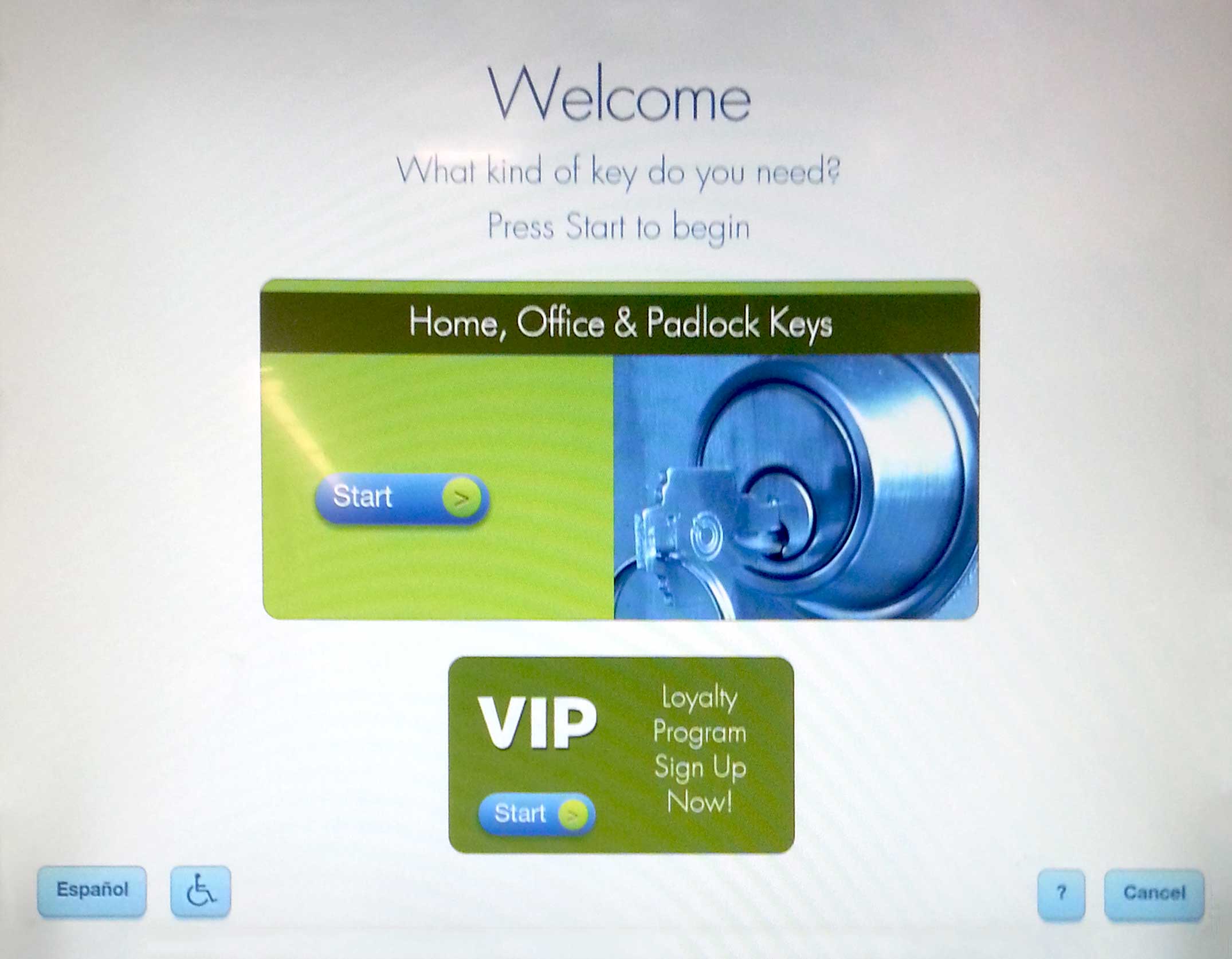
START SCREEN
Unnecessary elements
Confusing 2 start buttons
Makes it difficult to know what to tap on to start
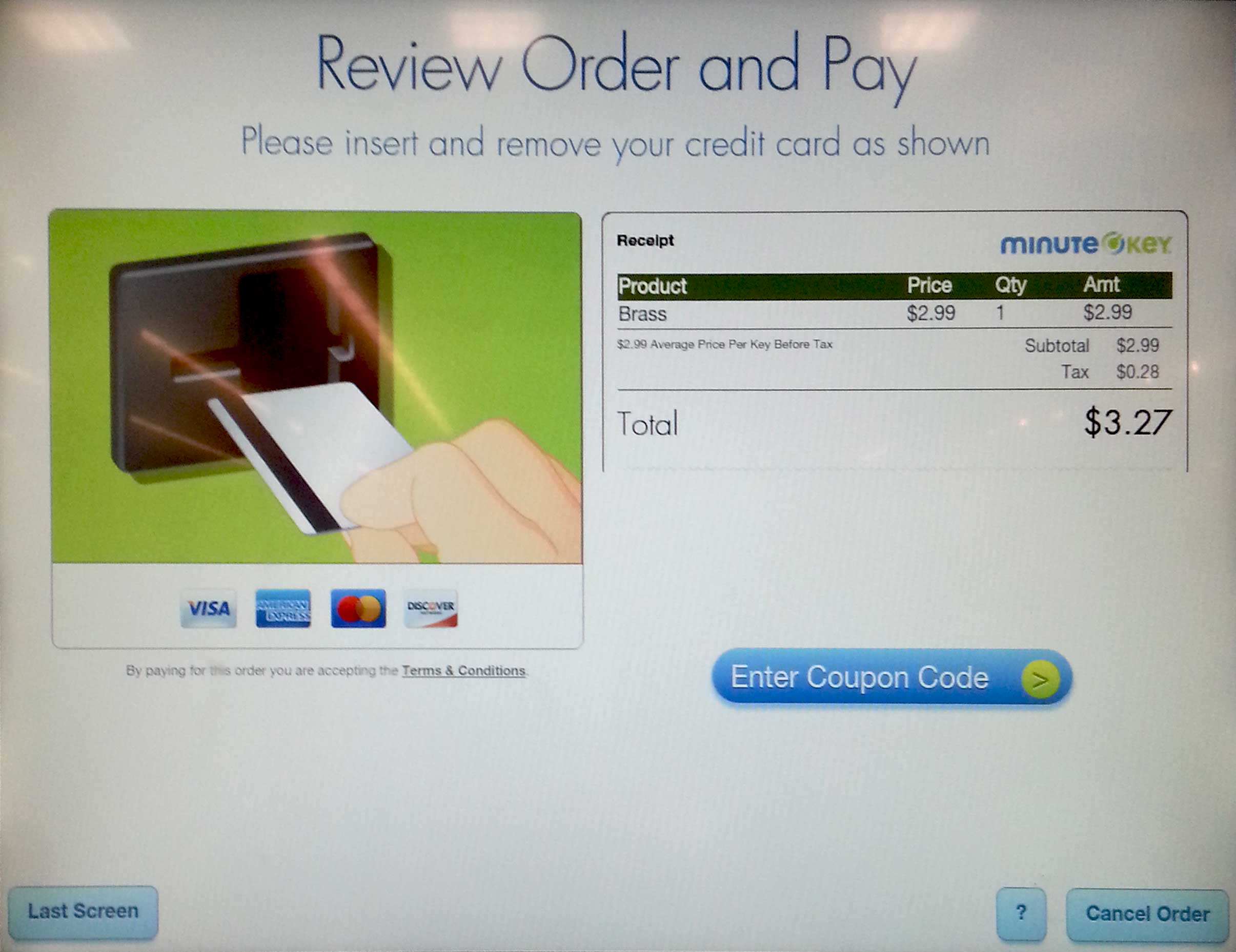
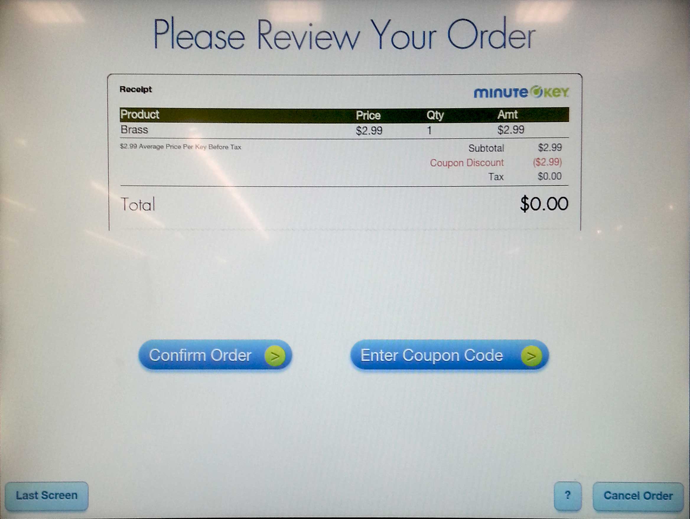
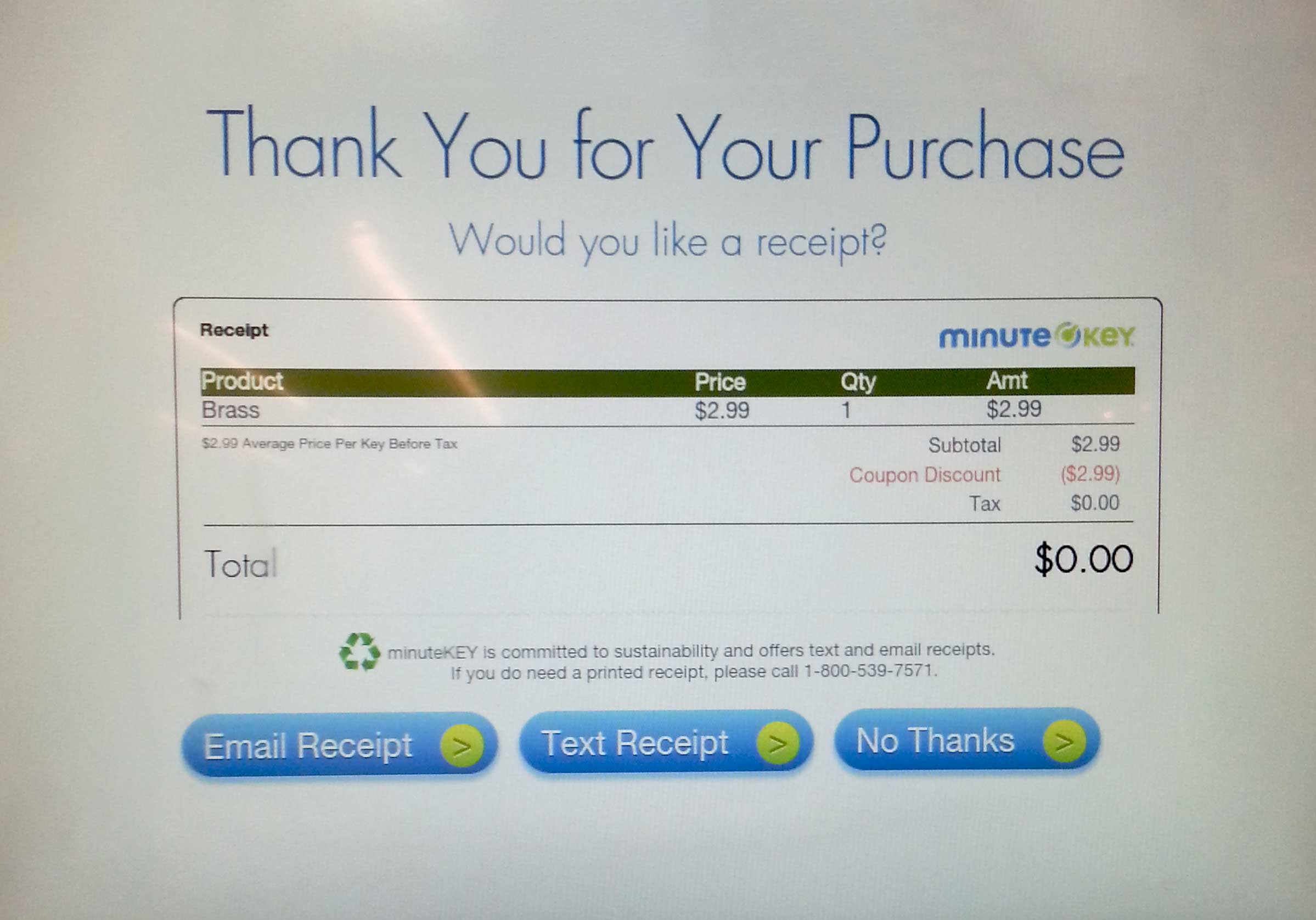
STEPS REQUIRED
1. “Start” button
2. Insert key
3. Add items to cart
4. “Checkout” button
5. “Add 1 More Key, Get a free Brass Key,” tapped “No Thanks” button
6. “Enter Coupon Code” button
7. Typed in code
8. “Confirm Order” button
9. “Email Receipt” button
10. Enter email address
11. Remove key
There are too many steps required and the screens related to payment look similar but different, which causes some confusion.
User Needs
PRIMARY
Quick
Easy
Secure
SECONDARY
Options: different key designs
Accessible to wheelchair users
No language barriers
Different payment options
Entertainment while machine makes new key
Duplicating multiple keys in single transaction
Quick & easy refunds
Scenario
AT THE GROCERY STORE
Janine is grocery shopping at Safeway with her son Jimmy. Her husband called her earlier today and told her that he lost his house key. He asked Janine if she could make a copy for him because he has to work until late today. Unfortunately Janine is very busy today and wonders when she will get a chance to make get the key duplicated.

Photo Credit George Doyle
AFTER PAYING FOR GROCERIES
After finishing up paying for all the groceries, she notices a self-service machine to duplicate keys. She decides to check it out and use it to make a copy of the house key.
STEP 1
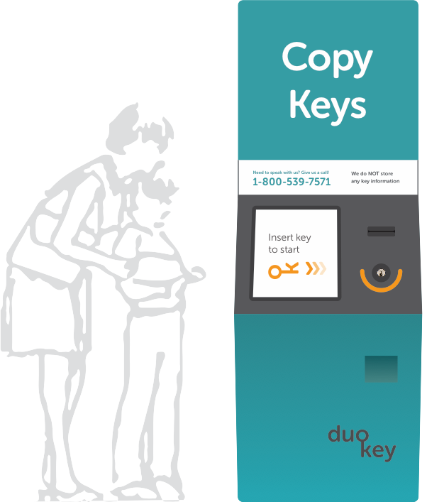
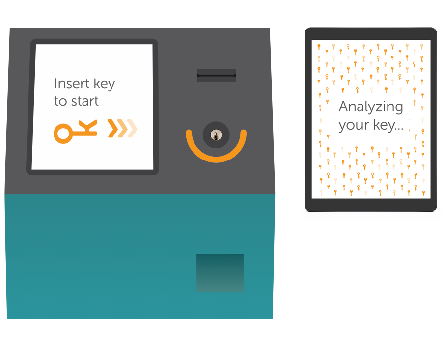
The home screen lets her know that she just needs to insert her key to start. She inserts her key and the machine analyzes it to determine the type of key.
STEP 2
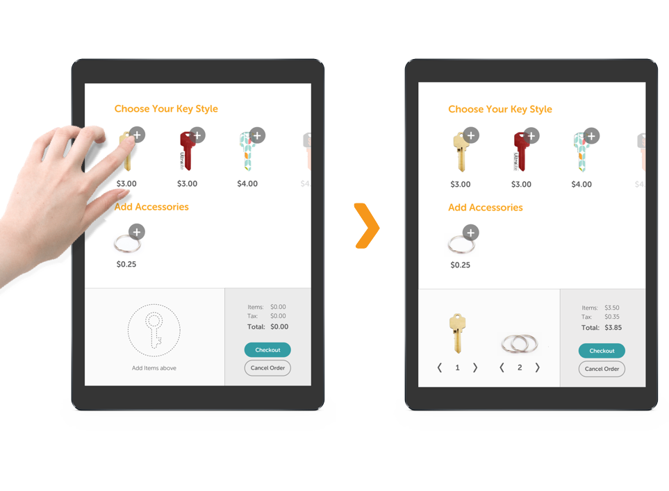
Janine is led to a screen where she can choose from several different key styles. She explores the different designs but decides to go with the cheapest key—the standard brass key. She adds it to her cart and also adds two key rings for 25¢ each.
STEP 3
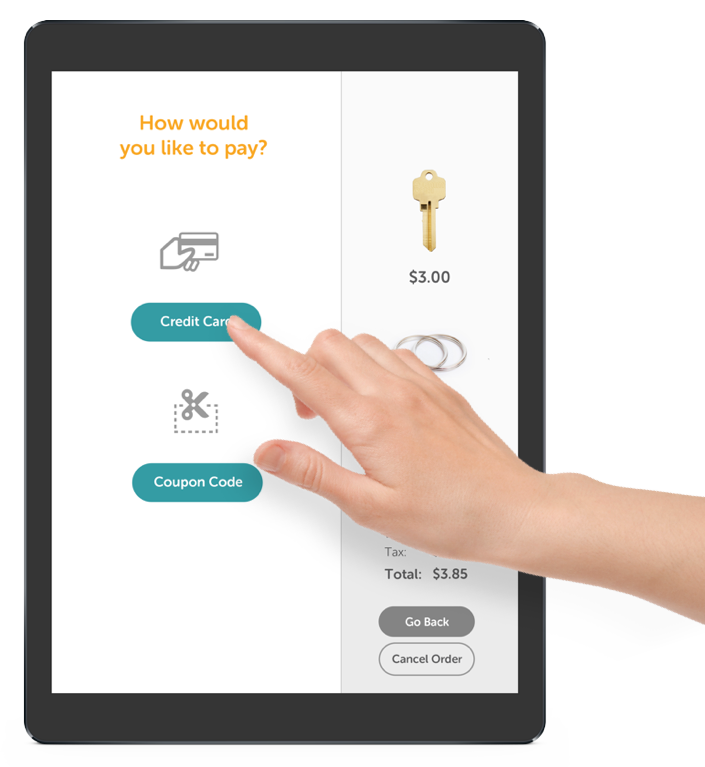
She sees the total cost of her items, including tax and checks out. She sees two forms of payment method. Since she does not have a coupon she taps the credit card button.
STEP 4
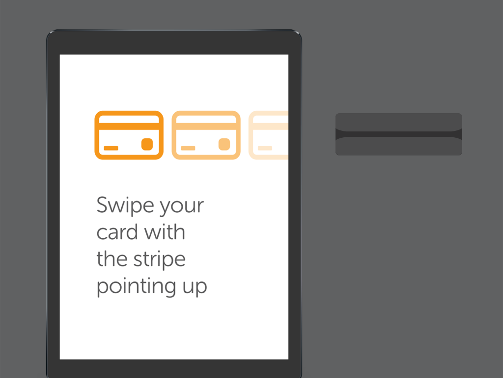
An animation shows her to swipe her credit card from left to right with the stripe toward the top.
STEP 5
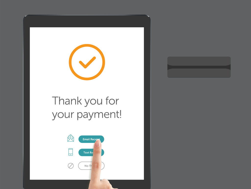
Payment confirmation appears with two difference choices to receive a receipt.
STEP 6
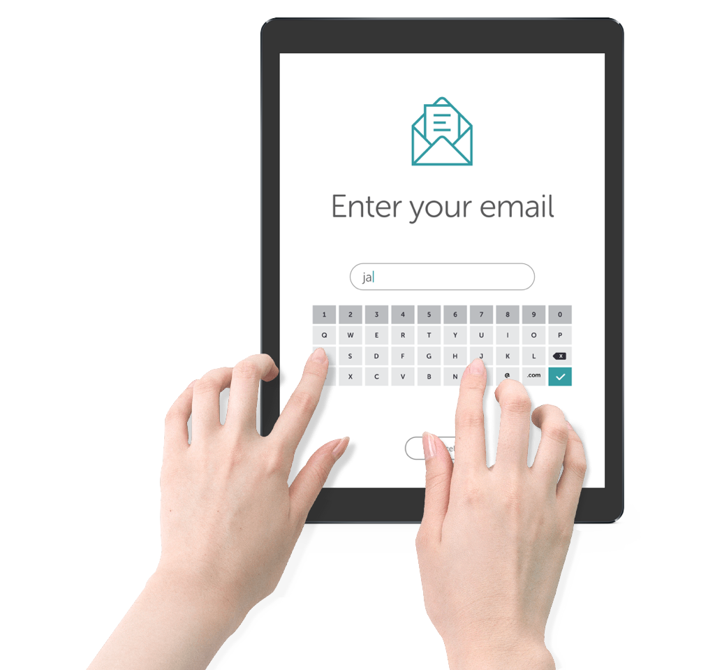
She sees several options for obtaining a receipt for her transaction. She chooses to have it emailed to her. A keyboard appears and lets her enter her email address.
STEP 7
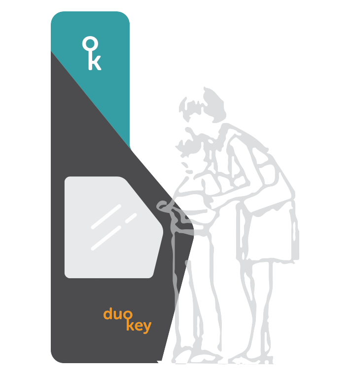
The machine begins to make the copy of the key. Jimmy looks at the machine at work through the side glass panel.
STEP 8
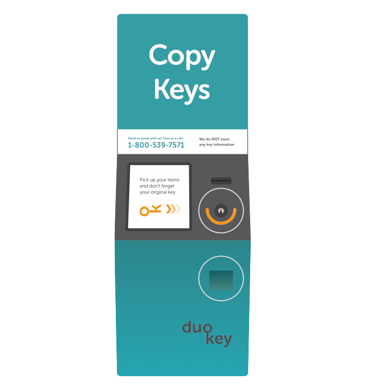
Once the copy is finished, the machine prompts her to remove her original key and pick up her new items. The whole process was quick and easy.
Thoughts
PAYMENT
Providing only card payment may be a little limiting. I made the decision not to allow cash because it would create extra expenses and complications (refunds, providing change etc). I opted out of giving out paper receipts for that reason as well. With improved technology, NFC could potentially be used to allow users to pay with their smartphones.
REFUNDS
Some customers complained that getting a refund on a miscut key was a long and painful process. With more time I would explore how to make the refund process easier and faster. For example, if users asked for an emailed receipt, users can access a link to an online refund form and get an immediate refund.
NEXT STEPS
With more time to talk to people about their experiences using the machine, I could better understand what their needs are. My next steps would be to make prototypes and test them with users.

