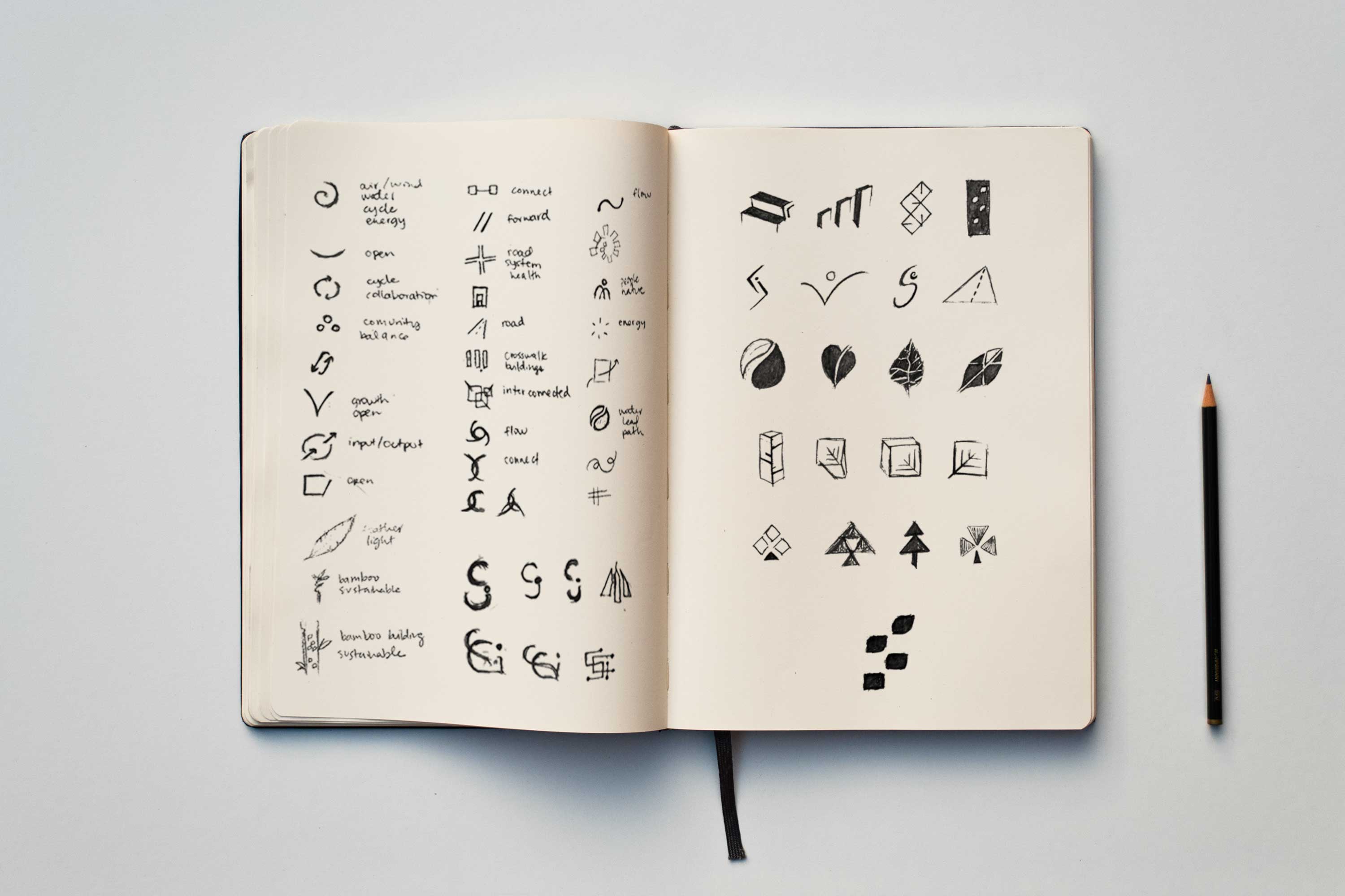
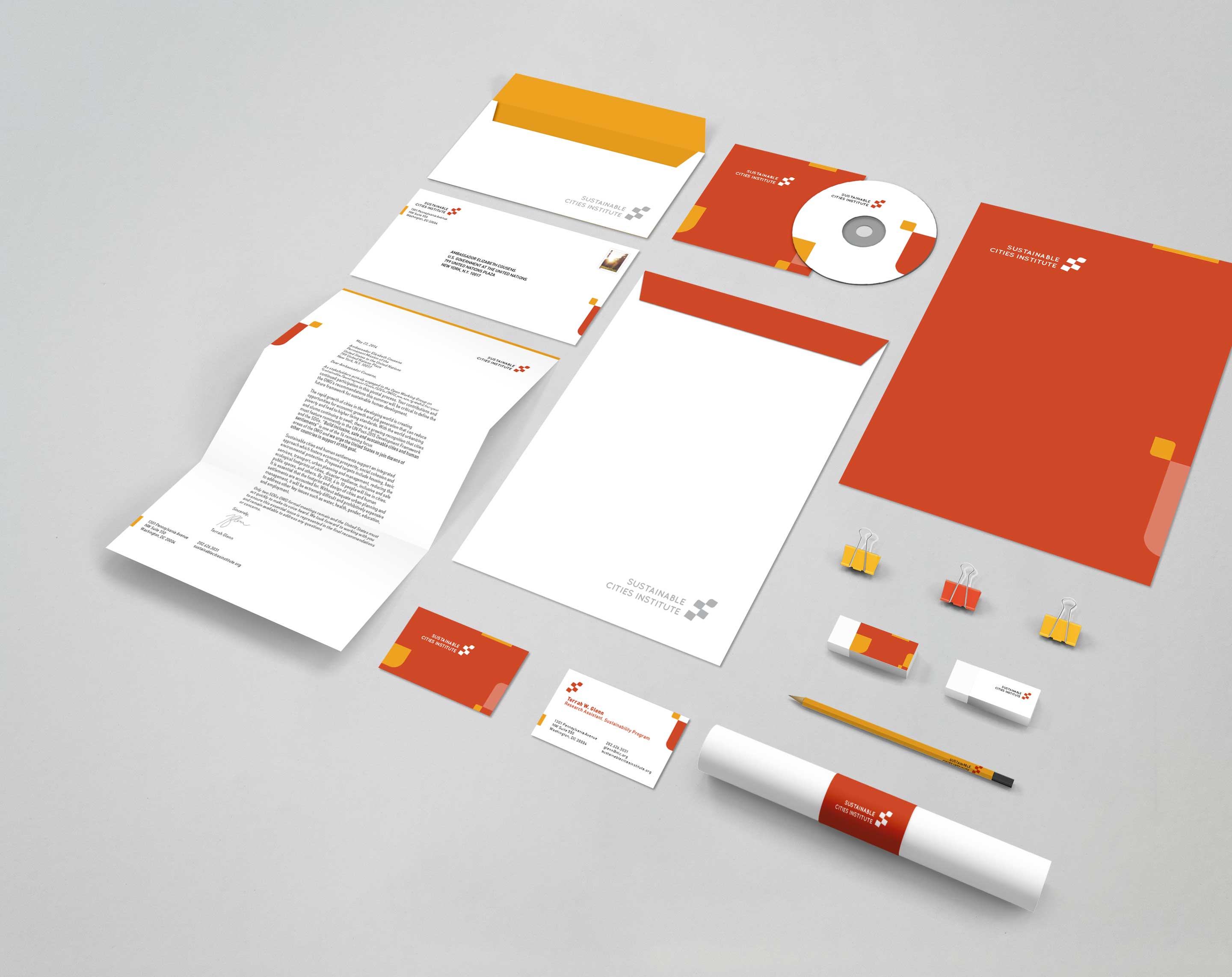
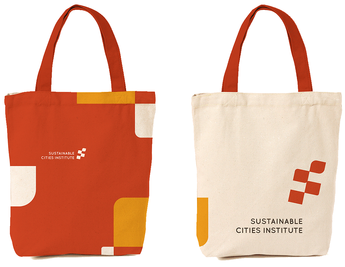
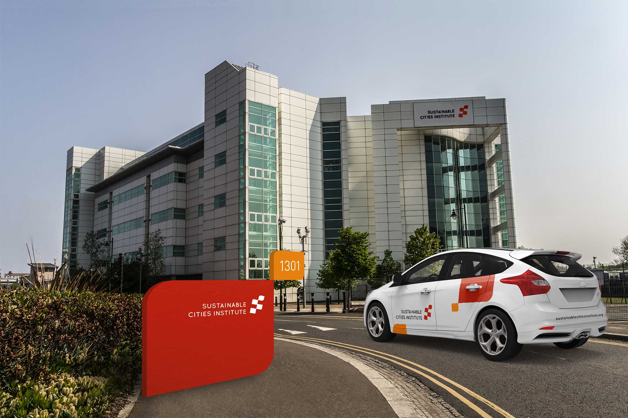
Primary Logo
Secondary Logo
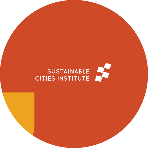
Primary Color

Secondary Colors

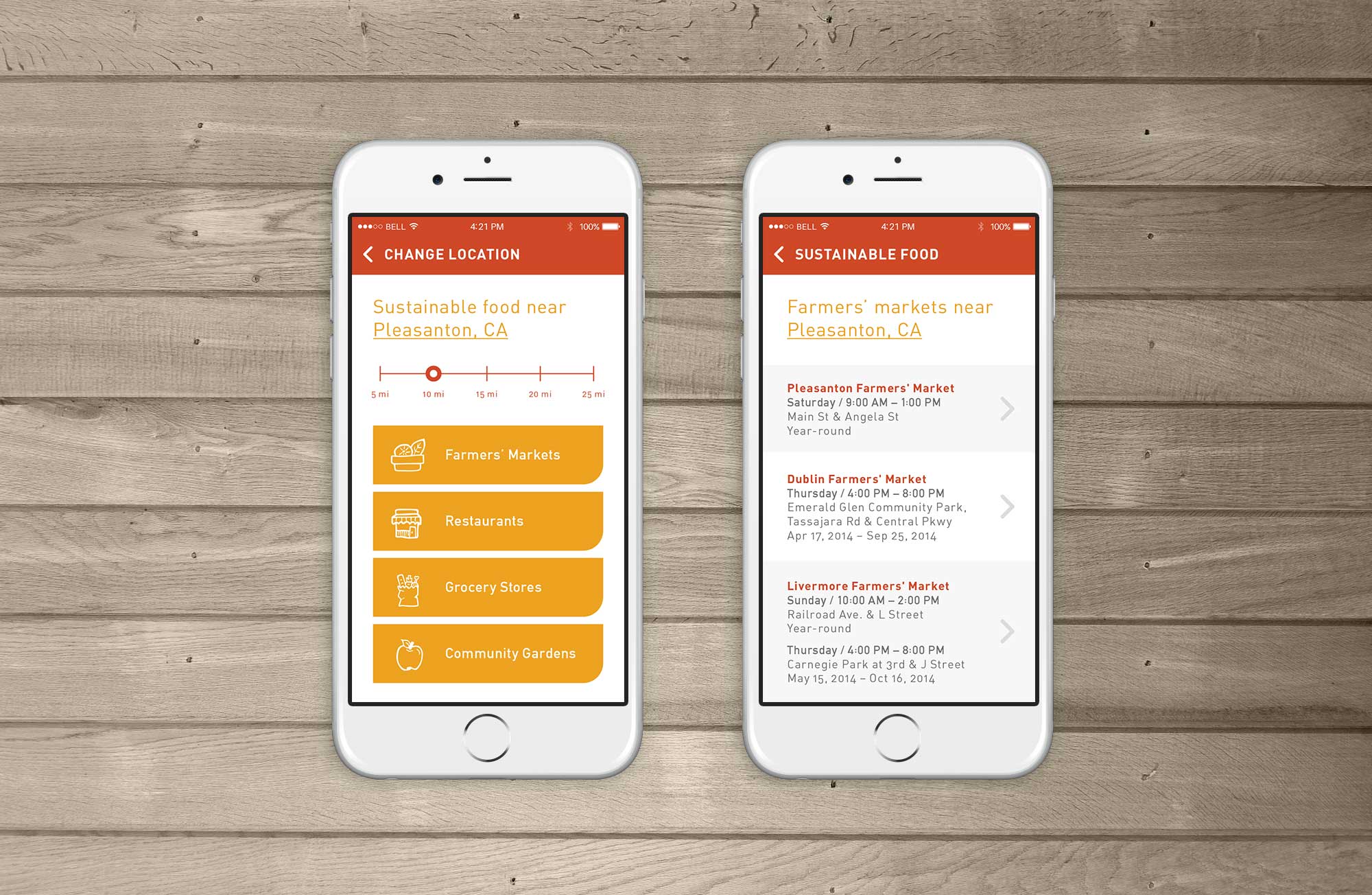
Primary & Secondary Fonts

Sustainable Cities Institute
“The National League of Cities' Sustainable Cities Institute provides cities and sustainability professionals with timely, vetted, and practical resources to identify and implement solutions to advance their goals and strengthen their communities.” –Sustainable Cities Institute
The four rectangles arranged in an S shape represent both the top view of buildings in a city and windows of a building. The rectangles morphing into a leaf shape to indicate the organization’s adaptability and search for constant improvement of society’s impact on the environment. The shapes are connected to emphasize the organization’s goal to connect people to the environment. The final symbol is tilted to the right slightly to indicate the organization’s innovative mindset.
Branding
Catherine Escoto
Bernadette Faller
Peter Nguyen
Professor Joe Miller

